
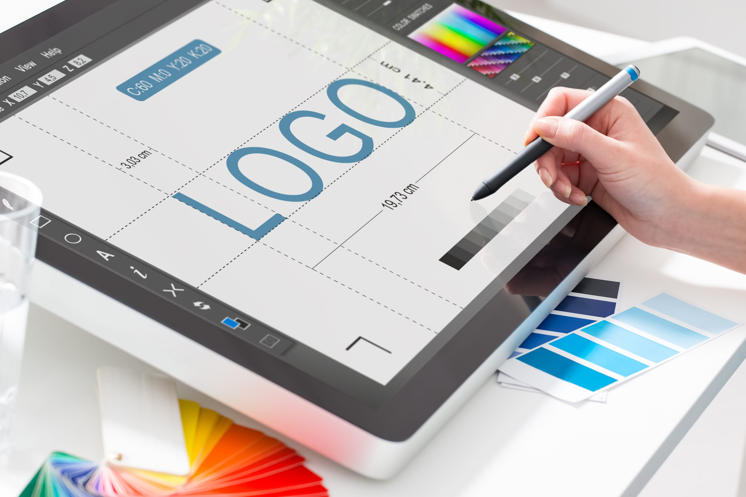
Design is the silent ambassador of your brand and also a logo design is the heart of a brand identity that presents the personality of a company or a product. If you want to set the connection with the target audience and tell the story of a brand, starting with a logo would be a good choice.
Today we will describe the visual components of a logo that are vital for compelling visual perception.
Psychology in Logo Design
To make an effective logo, designers have to consider the tiniest components of which it is built and think about the influence they will have on potential clients. The science studying the impact of various factors on the human mind and behavior is known as psychology.
Knowledge of psychological principles helps to understand human aspirations and motivations which means designers can predict the possible users’ reactions to certain solutions.
People may not notice but the mind often reacts to visual objects affecting emotions and behavior. In our previous articles, we described two psychology branches that study the impact of shapes and colors on people’s visual perception.
At Ready Web Solution, we provide professional logo design services at affordable prices. We have a team of experts to design your logo professionally.
In short, each color and shape tend to be perceived with its meaning, so when we look at a visual object our brain receives a certain message and reacts according to what we see.
By comprehending the role of color and shape psychology, design experts can control the meaning a logo contributes. Each component chosen thoughtfully helps people read the meaning of the logo right.
Color in logo design
The research provided by Colorcom showed that it takes only 90 seconds for people to make a subconscious judgment about a product and between 62% and 90% of that assessment is based on color alone.
That’s why the success of the brand strategy depends largely upon the colors chosen for the logo design.
Colors are a vital factor for not only the visual appearance of products but also brand recognition.
Red: Confidence, youth, and power.
Orange: Friendly, warm, and energetic.
Yellow: Happiness, optimism, and warmth.
Green: Peace, growth, and health.
Blue: Trust, security, and stability.
Purple: Luxurious, creative, and wise.
Black: Reliable, sophisticated, and experienced.
White: Simple, calm, and clean.
The color choice should not be based on the common meaning alone. Visual perception is quite individual for everyone so the color effects may be different because of factors such as age, culture, and gender.
For example, children like yellow color pretty much, but as we become adults it usually seems less attractive. Moreover, there are many cultural differences in color definition. To make sure the color will work effectively for a brand strategy, it’s vital to consider the preferences of the target audience.
Shape in logo design
People may not always notice what figures and shapes surround them still they have a great impact on our consciousness and behavior.
Many years of research and tests have helped professionals define what meaning each shape typically brings and how it can influence human perception. Let’s take a closer look.
Squares and rectangles meanings: discipline, strength, courage, security, reliability.
Triangles meanings: excitement, risk, danger, balance, and stability.
Circles, ovals, and ellipses meanings: eternity, female, universe, magic, mystery
Spirals meanings: growth, creativity, calmness, intelligence
Natural shapes meanings: originality, organic, balance, refreshment
Abstract shapes meanings: the duality of meaning, uniqueness, elaborate.
When creating a logo, designers should work on the shapes applied as well as pay attention to the typeface chosen for the wordmark.
At Ready Web Solution, we provide professional logo design services at affordable prices. We have a team of experts to design your logo professionally.