
Use these examples of good typography when experimenting with typographic design on your next web design project.
Put yourself out there with bold hero text
While text-only websites are not common these days, text-only hero sections are getting more and more love.
For hero text, most designers use a bold, condensed font in high-contrast colors to make the message compelling. Many opt for all-caps hero text, but be careful with this, as uppercase-only text can decrease readability.
The landing page of design and animation firm Ordinary Folk’s website prioritizes one font, sans-serif regular, and a black and off-white color palette. This minimalistic start acts as a palate cleanser: When visitors scroll down and see the vivid color images in the “featured projects” section, the colors appear even more striking because the landing page is so streamlined.
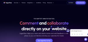
Liven things up with a text-fill
Text fills, which allow you to put text atop a gradient or image, are one of web design’s most attention-grabbing text techniques.
SuperFlow is a startup that makes a plugin that allows designers to collaborate and test ideas quickly, which means they can go through iteration cycles faster.
The designer of the SuperFlow site chose a color gradient text fill on the word “iterate,” drawing visitors to the one word that best sums up the value the company offers to customers.
Combine different fonts for emphasis
Font pairing is not just about distinguishing headings and text. You can also pair different fonts to direct readers’ attention to keywords and buttons on your site.
Creative production studio Noow Design’s site combines two web fonts: sans serif Mabry and elegant serif font Ivy Presto Display. This combination maintains visual interest while making sure the majority of the text (in Mabry) is highly legible and the keywords (in Ivy Presto Display) stand out.
They have perfectly balanced clarity with uniqueness here, telling the brand’s story with a beautiful image and a headline that describes what they offer while keeping the menu legible and noticeable in white against a black background.
Try a monospaced font
Most fonts are “proportional”, their letters have different widths. But in monospaced fonts, such as Courier and Lucida Console, all letters have the same width.
Programmers often use monospaced fonts because computers don’t read code the same way humans read text. Most people skim when reading, gaining meaning from the text with a glance. But code is a set of instructions for computers, and one misplaced character or illegible word means the computer would not follow each step properly.
For viewers, monospaced fonts lend a brutalist feel that is perfect for tech websites. They are also more legible than proportional fonts, making them more accessible for people with dyslexia.
The website of interior architecture firm Contekst uses GT America Mono and whitespace to give its site a brutalist feel to connect the design with their profession. While this helps us experience the brand, site designer Phil Bastiaans prioritized readability by pairing all-caps text with a monospaced font.
Use highlights and underlines
Highlights and underlines can draw visitors’ eyes to certain words. The website for interior garden design firm Vantage Spaces uses yellow underlines to stress the most important words in each section of the site.
This adds visual interest and directs visitors to a critical company goal: encouraging customers to inquire about its indoor planting designs.
The designer, Influx, also adds visual interest by using the font in a non-traditional way: “Planting the places where great teams thrive” rotates in a circle above the fold. This text strengthens the site’s brand presence, and the strategically chosen yellow font color ties it into the underlines.
If you are worrying about the typography and web design of your business, Ready Web Solution is here for you. We design websites with modern themes and typographies.