
A website’s homepage is essentially a snapshot of who a business is; it should reflect the brand, and what a business has to offer; It gives the visitor a summary of the products and services a business provides, as well as the unique selling point; what makes them different from their competitors.
By looking at a website’s homepage, a visitor should be able to quickly get a good understanding of those three elements without having to think too much.
Your website’s homepage design should include short content that provides them exactly that. It should not include long text that describes everything and anything about your business. If a homepage is too busy and complicated, a visitor will be scared off and is more than likely going to leave your site and find one that has clear and concise content.
In this digital world, web browsers have limited time and a lot of choices and they want to find what they are looking for easily with minimal effort, so grabbing their attention right away is key to keeping them on your site, and therefore maximizing sales. The longer a visitor stays on your site, the more likely they are to find what they’re looking for if you have done it right.
Your homepage is also the gateway to the rest of your site, so you need to let your visitors know that there’s more beyond just the homepage. It should give directions of where the visitor should go next; navigation should be clear, consistent throughout the site, and visible. The visitor should be able to easily reach all the information you have on your site from the starting point.
What should a Website’s homepage include?
Brand message
Your brand message includes who you are, what you do, and why you’re different. Your homepage could be the first point of call for potential customers, so it needs to fit within your overall brand strategy, and include your brand message.
If the name of your business doesn’t clearly identify what your business does, then include a short tagline describing exactly what it does.
Having your business’s logo is a no-brainer, but think about any other visuals that customers may associate with your brand. If they’re brand relevant then include them as well.
When selecting the color palette for your homepage and website, ensure that it is an extension of your brand’s color palette.
Consistency is key. Your website is an extension of your physical business so it should represent just that. Existing and potential customers should get the same feeling when they visit your website as they would when they enter your office.
Keep it Simple
Having an uncluttered homepage is key. Communicating your message in a clear and concise way through a mix of visuals and words is the best way to go, so don’t overcomplicate it.
Include calls to action
Supporting your brand message should be called to action. Once a visitor knows who you are, what you do, and why your business is unique, you need to tell them what to do next i.e. a call to action.
Depending on how you want visitors to navigate your site, and what you want them to do next will determine what language you use. Do you want them to subscribe, download, shop, etc.?
You need to guide them to the places where you want them to go, so having calls to action is a great way to do that.
Clear navigation
If a visitor finds it hard to navigate your site, they’ll leave it in a jiffy. Ensure that the navigation on your homepage is easy to find, and then easy to use. If not, browsers won’t go any further than your homepage.
Have your info on single landing pages
Set up your website in a way that you have the rest of your required content on landing pages with a single focus on each, rather than having every offer on the homepage.
If you have all of your offers on your homepage, it’ll be harder to track bounce rates i.e. how quickly visitors leave your site. Having a single offer per page allows you to track stats much more easily; the more you know about your visitor’s behavior, the more you can tweak your website to meet their needs.
Easy Split Testing
Busy homepages don’t give you the opportunity to conduct insightful split testing (A/B testing). A/B testing is comparing the results of two pages that are virtually identical except for one element. For example, testing the effectiveness of a call to action button or a landing page heading.
The original version is sent to one group and the variation to another group at the same time. Whichever gets more engagement is the one that is used; A/B testing is an easy way to increase conversion rates.
Conclusion
Your website’s homepage could be the first contact potential customers have with your business, so you want it to be a perfect representation of your brand. Just like you would do “an elevator pitch” if you met a potential customer in an elevator, your homepage needs to be compelling, interesting, and concise in order to win the visitor over as quickly as possible.
Your website’s homepage needs to be strategic, thoughtful, and unique, not just a mish-mash of information about your business. Getting creative and keeping it simple is key.
You want your message to stand out from the crowd, so come up with some creative ways to do that. But ensure that you keep it simple; a clear and concise message is much easier for visitors to understand.
Think of how a user would use your website, and make the homepage a doorway to the rest of your site. Ensure that navigation from your homepage to the rest of your site is visible and easy to use; if your homepage messaging is done well, it will entice potential customers to delve further into your site.
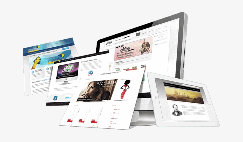
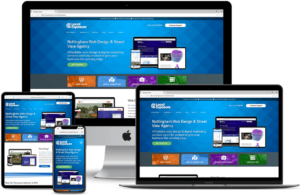
At Ready Web Solution, we provide business website design services to build your presence on the internet. We have a team of experts to design your website’s homepage in a professional way.

2 Comments